Tuesday, July 2, 2013

... More MOVIES...

The key concepts in the movie Last Call for Planet Earth: Sustainable Development and Architecture are the fight against global warming and how through architecture we can stop this change in climate and destruction to our planet. Energy can be reduced by 20-30% by building energy efficient buildings out of planet friendly materials and energy efficient equipment. Green architecture is the only way we as humans can continuing living on this planet because it will ensure harmony between humans and Earth. By building homes that have strategically placed windows to follow the pattern of the sun in order to heat the structure is a simple way to build green. However the modern technology we have to capture solar or wind power should be used in every building, because the way we harness and use energy currently is killing out planet. The green architecture movement can be applied to homes as well as cities. As stated in the movie 75% of all carbon emissions happen within cities. In order to stop this, a city must be conceptualized to be a city that works from the planet, being charged by the sun capturing solar energy and understanding that sustainability is the balance between what is saved and what is wasted. I thought this movie was very insightful expressing ideas on how to become a sustainable race, and all the different techniques and innovations architects have thought of which will bring us closer to symbiotic relationship with our planet. I chose this video because I agree very much with the idea of living with and from the planet. I believe our race has separated itself from the planet, being trapped by all the material goods and useless technology we have created. Planet Earth is the only planet that humans are able to survive on; therefor it is all of our jobs to keep this planet healthy and living. The road we are on now is destroying our only home we have in this universe. By living a simpler life, using less and reusing more, and buying and selling locally will help our planet recover from the destruction we have caused.
The second video I have chosen to watch is called Architecture: The Science of Design. The key concepts within this movie are the development of cities in response to new materials, over population, and techniques of constructing. The sky scraper is made up in two parts, the super structure, which is the main part above the ground and the substructure, which is the support system in the foundation. The substructure must support the deadweight, which is the weight of the interior shell, and the living weight, the items that fill the spaces, as well as battle the outside environment. This movie also bright to light the technologies and techniques used to plan and develop a high rise building within a certain area. One technique used in planning a high rise building within a city is to build a small scale model of the building and the city. With this the building can be tested to see if it will be able to with stand winds and other natural occurrences it might have to undergo within that area. A probe is then circulated around the building and its surroundings to collect data which is then transferred to a computer to be analyzed. This technique is used to find out what structural form the building must have and any other characteristic the building must have in order to be safe and sound. I found this movie helped reinforce the principles of architecture described in the book and bring to life the ideas and conceptions behind ancient and modern day architecture.   

Friday, June 28, 2013

... Peer Review...

These are my peer’s blogs I reviewed for this blog post:
After looking at two of my peer’s blog post and reviewing the two projects, a picture slideshow on the elements and principles of design and the art gallery visit, I feel as if I am on the right track. I thought the slideshows I reviewed were unique to the individual, as well as expressive both personally and academically. The first slideshow I viewed used household objects to express the elements and principles of design. I thought every picture that was paired with and element or principle was successful. I also like how the pictures were of everyday objects. The second slideshow I viewed was worldlier, since most of the pictures were taken in Europe. I thought this was a great idea because Europe is where many of these elements and principles were used, especially in the time of the Renaissance. What was even more spectacular was the fact that many of these pictures contained thousands of years old artifact and building, all of which have a story behind them. It was very inspirational to view the pictures and make the connection between them and the element and principle they were paired with. Many of the pictures did contain many examples of different elements and principles; however the one they were paired with was the most prominent characteristic within the picture.
For project two I was only able to view one blog posting, my other peer has not published her work yet. The one I did view did not have any pictures that were the same as mine, which made me very happy because I found some art work that I very much enjoyed and have never seen before.  I do not think the reasons these pictures were selected were the same as mine because we are two different people and have different reasons and opinions for our thoughts and reasoning. I do understand why he picked the piece of art he did and I think the reasoning behind his choices reveal more about him as a person, mainly his likes and dislikes. I enjoyed the pieces of art he connected to because many of them were very detailed and pleasing to look at. I thought Untitled, by Charlotte Spaulding Albright was the print I connection to the most. I like how I can look at this picture then see the backyard at my father’s house, and where I grew up for 20 years of my life. It also intrigued me that this print had no title. I think the artist left this print untitled because there is and there cannot be a title for this. It is a picture that is intended to bring up memories which will be unique to everyone. If you put a name on this print it will identify a certain place, and the nostalgia of remembering a place like this in your childhood would be lost. With more information about the artist and inspiration behind this piece I could see if my hypothesis is correct or not.
I thought the peer reflections were very mind opening and enlightening. After reviewing all of this art and seeing and felling the art, I want to share this experience with other people, as well as hear about their experience. I believe this is a good way to really understand meanings behind the art and validate your impressions on the art. Examining art is a good way to analyze your impressions on the world and it
Unfortunately I have not received any comments, however I am looking forward to them!

Tuesday, June 25, 2013

... Videoooos...

The video Through the Eyes of the Sculptor, follows a master artist and his developing a passion for sculpting throughout his life, as well as reveals the mass amounts of work that has to be done in harvesting the marble. Quarrying is the act of extracting stone out of the Earth. In order to sculpt a whole work force of quarry men are needed. When the stone is extracted the artist must come and choose the right block, banging the marble block can revel cracks within the stone therefor a skilled ear is a must. Then the sculpture travels among many sculptures hands, first being small clay sculpture to plaster, and finally marble. The video also discussed the relationship between the quarry men, the marble, and the sculpture. Reading chapter 11 allowed me to see how each item used reacts and changes during the sculpting process and paired with this movie I am able to see how everything comes together in order to make a beautiful piece of fine art. I thought this video gave a deeper look into the passion and inspiration the sculptor feels about his work. I have always seen marble sculptures and thought they were all mass produced therefor I did not look into them very much. Now that I know how much work goes into harvesting the stone, then going through the whole process from clay to plaster ending in marble is I have a new appreciation for the sculptures.
The film Glass and Ceramics, discusses the difference and similarities of glass and ceramics, and the origin and development of these two materials. Glass is made from silica, which is sand, and is heated up to a molten state. From here additives such as oyster shells can be added to help stabilize the glass crystallization structure as it cools. Molten glass is then shaped into the desired form through blowing or hand shaping with tool such as a marver. Then the glass is cooled within a kiln until all the crystal structures have reformed, producing a hard, and durable glass sculpture. Ceramics is similar to glass in which it must be heated up to break down the crystals. Ceramics are made from clay which is a rock which is grinded down and mixed with water, producing slit. It is pressed and rolled into lags which are then ready to be molded or sculpt. The item must be fired or heated to a high temperature which is very important in giving the item their durable and strong characteristics. Glass and ceramics play of vital role in our lives affecting almost every aspect such as technology, architecture, and the medical field. Chapter 11 and 12 gave me more insight on where these items originated and how these items are fine art as well as crafts.
The video Installation Art discussed the evolution of instillation art through the years. How taking everyday objects and see them as fine piece of art, changing facade of building to create a moving piece of artwork and how this fascination with the ordinary everyday life led to art movements such as pop art. As see in chapter 11 instillation art can be draping a nylon curtain between two mountains in Colorado like Christo and Jeanne- Claude did. Video instillation is becoming very popular as well. Site specific art is a form of art where the meaning would be useless if that art piece was not in that specific location.  Video and visual performances are used to invoke emotion by showing everyday objects or situations or streaming a video on a corner distorting the images. I have seen this style of artwork at the Albright Knox on my visit and I did not understand them. However, after reading these chapters and watching the video I have a better understanding of the vision and creativity these artist have and the amount of determination to succeed in this labor demanding art form. I also realized that I was supposed to interact with instillation art in order to understand it. After see the example in the video I see how my interactions with the artwork while viewing the artwork will help me develop a meaning to the piece.

Saturday, June 22, 2013

... Pears...

For this project I was asked to make a logo that best expressed me. After watching the videos I realized how each company wanted to stick to their original, unique identity. The video, Graphic Design: What's in a Logo, showed me how hard it is to make a logo that represents the company. I see how hard it is for people to create ideas for companies then get turned down instantly because it was not what the company wanted. However, for this project it was easy for me to create my own logo because I knew exactly what would express my identity and my unique personality. In the video, Bottled Up: Repackaging the Brand , helped me understand how you can take an original idea and jazz it up to make it even better. Both of these movies opened my eyes up to the creative and development process.

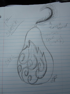
Therefore, I began brainstorming ideas. After visiting the Albright Knox gallery, I was feeling very nostalgic. As I wrote my other blog, as well as this one, I remembered a time in 2003 where I painted a very special painting to me. I always had a thing about drawing pears. I love the shape, the curves and the look of it. It feels good and easy draw and it is my favorite color: green. The first thing I thought of when I was asked to design a logo was this picture I did in my 8th grade studio art class:


This was one of my first paintings of a pear! I do not know why I like painting pears so much but I remember this day perfectly. I was very proud that I was able to paint such a lovely looking pear. Then I was inspired to paint another:

These two pictures were the fundemental element that inspired my logo. I felt comfortable with the pear and it was happy to be drawn by me. The video, Graphic Design: What"s in a Logo showed how desginers would come up with plenty of unique and inpired designs and the company would dig through and picked out just one idea. In my opinion I saw that as a simple organic design. It was not my favorite one, but seeing the logo on the company door connected that picture to an idea. I see this as a good description of my relationship with pear. Therefore I started to doodle:
1.

2.

3.

4.
That is my final logo. Seeing it now I have mixed feelings. I like what it represents, but the rainbow is a little cliché. This pear is a representation of my personality, ethnicity, and profession. My personality is colorful, strange, and simplistic. The pear is an everyday object; something that everyone can relate to, which I feel can express me. I am always in an optimistic mood; I am always bright and colorful. The feather represents (another cliché) my American Indian ethnicity. My Grandmother is a full blooded Tuscarora tribe member and I have grown up with a lot of feathers in my life because of her. The dark part of the pear to supposed look like it was made of dark chocolate. I have found a new passion when I obtained my most recent job at a Niagara Falls Culinary Institute. I work as a pastry cook under one of the sweetest, inspirational, genius chef. She had become a mentor as well as a wonderful friend. I was not knowledgeable in the pastry arts when I started, however through a lot of hard work and the training with my dearest chef lady I became responsible for all of the chocolate production. It was a great achievement in my life and I am happy I have developed a love for it. This paitning represents all of me and I am very proud I produced this.

Tuesday, June 18, 2013

... Art Gallery Exploration #1...

For this project I needed to go to an art gallery and answer three questions about some pieces of art work I observed. I want to the Albright Art Gallery in Buffalo, NY, one I am very familiar with. I have been there many times, some of the times on school field trips and others for personal entertainment. I am in love with this art gallery. First you are greeted by fashionable receptionist that welcomes you with open arms, and then you are freed to explore the gallery starting in any which way you want. I observed all of the paintings and sculptures on the first floor than made my way to the second floor for more wonders.

 The first question I was asked to answer was: Which artworks make an impact or impression on me? Why? For this question I walked around the first floor, observing every painting and sculpture, then making a second round and finally choosing two artworks that I thought best answered this question. The first artwork was a painting by Clyfford Still called, Gift of the Artist, oil on canvas, produced in 1946, and is shown here:

I chose this as the first painting that really made an impression on me because as I stared into the deep, rich yellow and an overwhelming sense of calmness came over me. I had just taken a math exam right before I came to the gallery, so I was a little stressed out. The different shades of yellow and the small pop of blue at the bottom makes me feel a warm and comforted. I felt happy and relieved when I saw this picture the first time and was pleasantly happy laying my eyes on it the second time around.

The second painting that made an impression on me was a painting by Gustave Courbet called, La Source de la Loue, oil on canvas, produced in 1864, and is shown here:


I was compelled to investigate this painting because after feeling so uplifted from the last painting I needed something to bring me back to finding out the mystery of art. The last painting was a simple color that was bright and cheery; however this painting shows the mouth of a cave that is dark and mysterious. As I ponder the meaning behind this picture, I begin to think about the meaning behind my thought about this and the last picture. How can I go from feeling calm, and splendid, to wondering what horrors lay at the end of that watery cave? This is what impressed me the most about this painting. Not only did it open my mind to what is in the cave, I was asking myself, what is at the end of my cave? Of my mind? I love pictures that make you think. 

The next question I was asked to answer was: Which artworks do I feel a connection with? Why? Being a longtime patron of this art gallery I already knew which artworks I had deep connections with. The most influential and important art piece that I adore was not there. It was heartbreaking. I searched and searched, but I could not find it. Maybe someday I will have time to talk about it, but for now I will stay on topic. The first painting I felt a strong connection with was painted by Giacomo Bella called, Dinamismodium un Cane al Guinzaglio (Dynamisiom of a Dog on a Leash), oil on canvas, produced in 1912, and is shown here:


As I gazed into this picture I remembered a simpler time, the 8th grade, when I was in studio art with one of my very best friend named David. I cherish this man. He has been one of my best friends from grade 4 until now, and I love him very much. I made such a connection with this painting because I have seen it many times within my life. The first time I have ever seen this was when David recreated it in studio art class. David was the smartest man alive at this point and told me everything he possibly could about this piece of art. This painting captures something very hard when it comes to painting, and that is motion. David was excited to recreate this painting and I was able to share in this excitement. I believe this is why I love this painting so much.

The second piece of artwork that I was able to make a connection with was produced by Roy Lichtenstein called, Explosion from Portfolio 9, linthograph, produced in 1967, and is shown here:


 As mentioned earlier in this blog Roy Lichtenstein and his art pieces have influenced me much of my life. One summer I printed as many Lichtenstein paintings as my printer could, cut them out, and made a mural of pop art on one of my bedroom walls. I love the way he takes everyday objects and put them into a comic environment, using colored dots to fill in the color, and using word bubbles to narrate the image. For this question I could have picked any of the paintings that were being shown in the POP Art display on the second floor, but this print caught my eye because of something I learned in this class. While studying this print I was 47/100 penciled in at the bottom left corner. Before this class I would have disregarded this, however now I am able to say with confidence that that was the 47th print out of an edition of 100. I like how this print was able to connect with my extreme life a funky images and the knowledge I am obtaining through my education.

The last question I was asked to answer was: Which artworks would I like to know more about? This was an easy question to answer because I stumbled upon two pieces of artwork that I found completely confusing. The first piece of artwork was painted by Tauba Auerbach, this piece was untitled, acrylic on canvas, and produced in 2012, and is shown here:


Now let me rephrase the medium in which this PAINTING is made out of: Acrylic on canvas. How the heck did this man create a painting that looks like a very beautiful crumpled piece of green paper? The texture Auerbach was able to create with acrylic paint is remarkable. I found myself one foot away trying to examine how through color and shades this effect of wrinkles could be produced by paint. I would love to see more paintings by Auerbach, and learned how he is able to produce such textured paintings.

The second piece of artwork that I would love to know more about would be the sculpture by Marcel Duchamp called, Why not Sneeze Rose Selavy?, made out of marble cubes, thermometer, metal cage, perches, and cuttlebones, produced in 1964, and shown here:


The reason why I chose this sculpture that I wanted to know more about is because I have no clue what this sculpture is or its meaning. I literally have no perceived message from looking at this. I like this sculpture a lot, but I am not able to produce an opinion on what meaning this could have or why it was made. I believe if I were to research the history of  Duchamp and get some background information I would be able to form a better opinion on this piece than I am able to do now. Yet again, I love pieces of art that make you think…

Saturday, June 15, 2013

... Exploration of Color and Values...

For this project I was asked to make a simple color wheel and a value scale. When I first read this I thought it was going to be easy because I have always loved to draw and paint even more so, therefore I saw myself as a professional. The value scale was not hard to create. I made a 10' x 1' rectangle and created ten 1 inch squares within the rectangle. I started at the left and finished at the very right, which corresponded with the values black to white. It was a little difficult to gauge how dark squares 2-9 should be, but I believe I accomplished the task with some accuracy. Here is my value scale:


I used a graphite pencil to make this value scale.

The color wheel was a whole different story. As shown in the movie, I was under the impression red, blue and yellow were the primary colors. However, after watching the video I was able to see much clearly how magenta, cyan, and yellow ere the actual primary colors. When red, blue, and yellow were mixed in order to create the secondary colors, the colors turned out darker and clouded compared to the mix of magenta, cyan, and yellow. I thought this was eye opening because I have always thought that red, blue, and yellow were the primary colors, and in reality they are not. This discovery was most shocking.

I was able to obtain Daler and Rowney Process Cyan 120, Liquitex Deep Magenta, series 3, and the Fine Touch yellow. I should have probably red the outline of this project and watched the youtube video Color Theory 2 before I went and bought the supplies for this project because I bought the wrong magenta. My color wheel turned out ok, but I know that the magenta I bought was the wrong color therefore throwing off my colors a little. The red and blue are too dark; however the green is right on. Here is my color wheel:


I was unable to rotate this picture it was supposed to be seen in a landscape view. The color block below the cyan is supposed to be blue, however the picture the camera capture makes it look like black, and in person the block looks like a deep purple. The block of color in the very left column should have been red, however it looks like a dingey orange. Watching the video and creating a very bad representation of a color wheel allowed me to understand the colors a little bit more. I have always loved to paint, but I would often end up extremely frustrated because the colors were not correct. I even remember a time when I attempted to paint my living room a mustard yellow but ended up buying a bright orange. I do not know what I was thinking at the store, it was an awful decision. However, through this journey of color I am able to understand what makes up color, the pigments that are used in paint to create each color, and how I am able to perceive color. Hopefully this new insight will help me make better color decisions in the future.

Like I said before I was always prefered painting over drawing. I like the way paint blends with other paint so easily and the endless shades of colors you can obtain with little paint color selections. When I was at the store buying the project supplies I also bought three canvases, a bag of brushes, and an acrylic paint set. This project has been inspiring.

Sunday, June 9, 2013

... The Elements and Principles of Art and Design, by Grace...

Exploring the world through the elements and principles of the art and design by photography opened my eyes to everyday works of art. I was able to take all of my pictures this beautiful Sunday morning, through afternoon with my mother in Lewiston. We participated in the Lewiston Tour of Kitchens, which featured homes that were open for viewing paired with local restaurants that supplied samples of delicious cuisines. Before leaving the house I made a list of the elements and principles of art and I was able to steal my sister’s camera for the day. We were able to capture pictures on the way there and at every stop on the kitchen trail. Surviving many dropped samples and creatively set tablescapes, we were able to capture simple every day pictures that explored one of the elements or principles of art and design. I have to thank my mother for many of the pictures. She is a creative, wonderful woman who inspires more than just beautiful pictures!
I captured all of the pictures on a Canon Power Shot camera. This camera was very easy to use and it took great pictures. I was able to get very clear close ups and distant action pictures with ease and accuracy. My mother and I searched for anything that represented an element or a principle of art and took pictures of it in different angles and distances. Then I was able to upload and sort the pictures that I thought best represented an element or principle. I found it was easy to express these traits of design through simple, everyday life. My favorite picture is Space. This picture shows two barn swallows sitting on the power lines with the Niagara River flowing through the background. The open space makes the viewer immediately focus on the two birds, and the distance between the two birds allows the viewer to examine each on closely.
Here here my album.

http://s1302.photobucket.com/user/plattgm01/slideshow/Elements%20and%20Principles

I was unfortunalty not able to embed my slide show within this blog. I tried all the directions given and even looked for outside help and I was not able to find a solution.