For this project I was asked to make a logo that best expressed me. After watching the videos I realized how each company wanted to stick to their original, unique identity. The video,
Graphic Design: What's in a Logo, showed me how hard it is to make a logo that represents the company. I see how hard it is for people to create ideas for companies then get turned down instantly because it was not what the company wanted. However, for this project it was easy for me to create my own logo because I knew exactly what would express my identity and my unique personality. In the video,
Bottled Up: Repackaging the Brand , helped me understand how you can take an original idea and jazz it up to make it even better. Both of these movies opened my eyes up to the creative and development process.
Therefore, I began brainstorming ideas. After visiting the Albright Knox gallery, I was feeling very nostalgic. As I wrote my other blog, as well as this one, I remembered a time in 2003 where I painted a very special painting to me. I always had a thing about drawing pears. I love the shape, the curves and the look of it. It feels good and easy draw and it is my favorite color: green. The first thing I thought of when I was asked to design a logo was this picture I did in my 8th grade studio art class:
This was one of my first paintings of a pear! I do not know why I like painting pears so much but I remember this day perfectly. I was very proud that I was able to paint such a lovely looking pear. Then I was inspired to paint another:
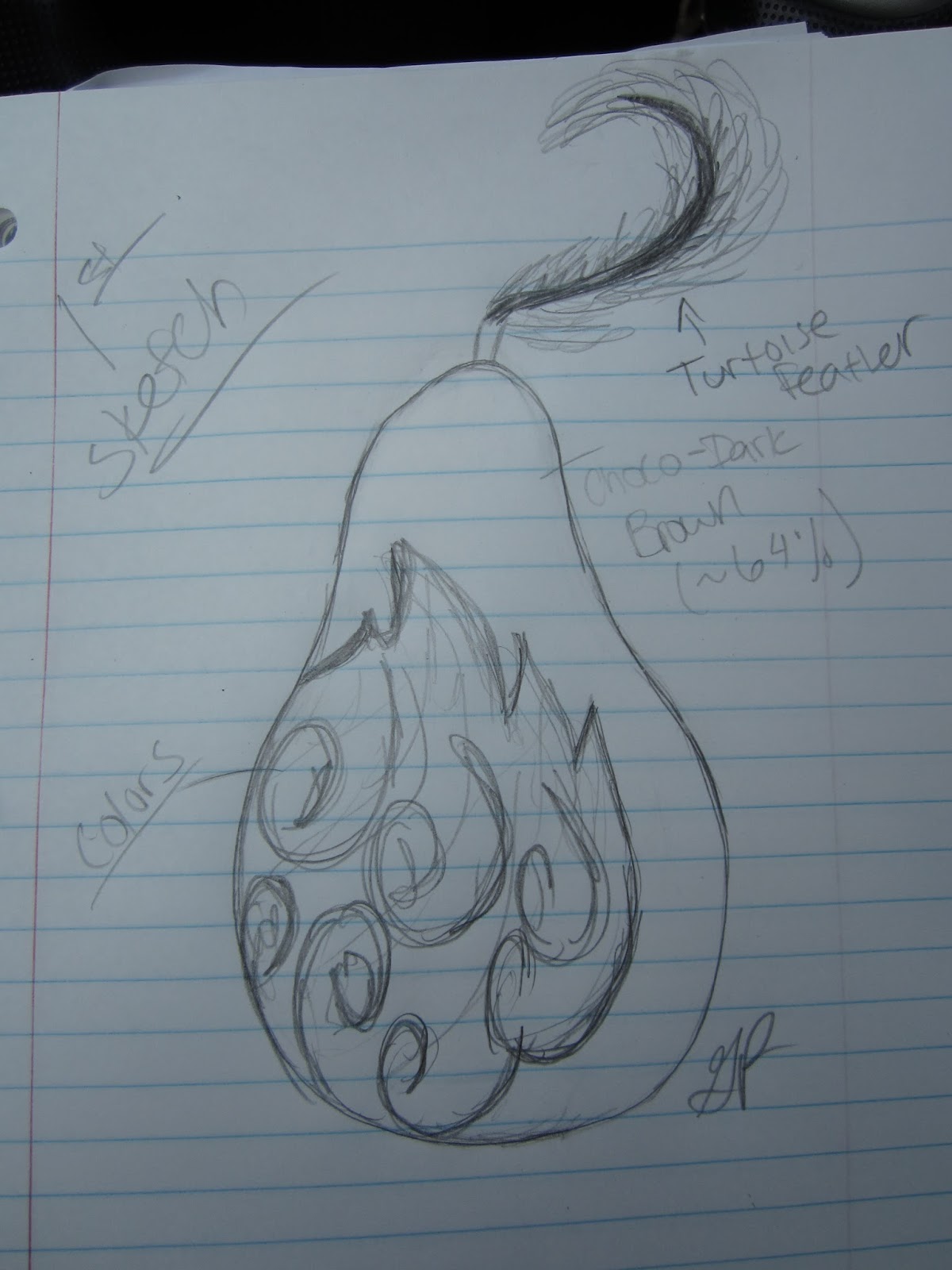
These two pictures were the fundemental element that inspired my logo. I felt comfortable with the pear and it was happy to be drawn by me. The video, Graphic Design: What"s in a Logo showed how desginers would come up with plenty of unique and inpired designs and the company would dig through and picked out just one idea. In my opinion I saw that as a simple organic design. It was not my favorite one, but seeing the logo on the company door connected that picture to an idea. I see this as a good description of my relationship with pear. Therefore I started to doodle:
1.
2.
3.
4.

That is my final logo. Seeing it now I have mixed feelings. I like what it represents, but the rainbow is a little cliché. This pear is a representation of my personality, ethnicity, and profession. My personality is colorful, strange, and simplistic. The pear is an everyday object; something that everyone can relate to, which I feel can express me. I am always in an optimistic mood; I am always bright and colorful. The feather represents (another cliché) my American Indian ethnicity. My Grandmother is a full blooded Tuscarora tribe member and I have grown up with a lot of feathers in my life because of her. The dark part of the pear to supposed look like it was made of dark chocolate. I have found a new passion when I obtained my most recent job at a Niagara Falls Culinary Institute. I work as a pastry cook under one of the sweetest, inspirational, genius chef. She had become a mentor as well as a wonderful friend. I was not knowledgeable in the pastry arts when I started, however through a lot of hard work and the training with my dearest chef lady I became responsible for all of the chocolate production. It was a great achievement in my life and I am happy I have developed a love for it. This paitning represents all of me and I am very proud I produced this.


No comments:
Post a Comment